Friday, February 28, 2014

Shutter Drag

While debating over what I wanted to eat for dinner, an idea popped into my mind for a photo. I've experimented around with this before, but never really done anything serious.

Shutter drag means that you have your shutter open for longer than the "correct" amount of time. This allows you to blur motion or other parts of your scene. It's used a lot in sport photography while panning with a subject to create a illusion of speed and motion. What I wanted to do with it tonight was just make a really odd image that would make people think a bit to figure it out.

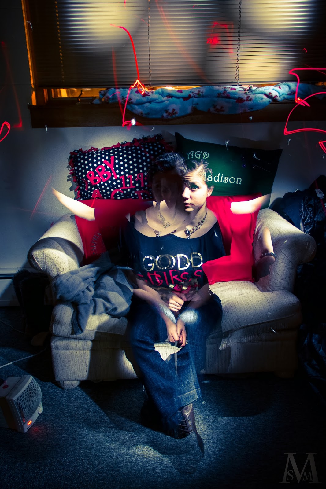
I knew I wanted to use a fisheye to expand space, but I wasn't sure how I was going to use shutter drag. I played around with moving the camera in various ways in relation to myself, this got me a lot of different blur/frozen subject combinations. I eventually went with holding the camera directly above my head and spinning around. I would remain fairly stationary in relation to the camera, but the background would get really blurred. I used a shutter speed of 1 second with an aperture of f5.6. This gave a nice long time to blur while still not over exposing the image.

I tried this a few times, and it's basically impossible to keep the camera exactly in the same spot overhead. My face just wasn't staying sharp enough, so I added in a flash to freeze my face. At first I used a soft box, but that lit up and froze the rest of the room too which was not to my liking. I switched to a 1/8 grid to focus the light only on my face. At 1/128 power, this gave me just enough freeze to make my face fairly sharp, while not making it look completely unnaturally lit. I had a lamp on in the corner of the room, so that cast a nice warm tone and provided both fill and a rim light for me.


In Lr, I just applied the Cross Process 2 filter and was done with it. There's not much to do with a photo like this unless you want to put a lot of work into it.

So lets talk about shutter speeds a bit more. First off, every shutter speed, no matter how fast it is, is going to have some motion blur. Whether or not you can see that motion blur to the point where it's distracting is what dictates if you've "frozen" the action or not. Sometimes, the motion blur will be smaller than a pixel, so technically it's nonexistent. But remember that no matter how short a shutter you're using, its still an amount of time for the world around the camera to move. So while you may freeze a sitting person at 1/500 of a second no problem, catching a F.1 car in profile at 200mph is going to have a heck of a lot of motion blur. Freezing action is completely subjective to a couple of factors. How fast is your subject moving in relation to you? What light source is lighting your subject, is it a strobe or a continuous light? What is your shutter speed? With these three questions, you can pretty much calculate how fast of a shutter you need to get the amount of blur you want.

For example, if I'm shooting in daylight and a F.1 car going 200 mph coming right towards me I can probably get away with using 1/500  of a second to freeze the car. Even though the car is moving really fast, since it's coming right toward me it's not moving that fast in relation to me. If it was moving in profile to me, that is perpendicularly, then I'd need 1/1000 or even 1/2000 of a second to catch it. However, if the car was being lit by a strobe that had a t.1 time of 1/1000 of a second (not likely) then I could use any shutter speed I want because the car is being frozen by the light and not the camera.

So applying all this to the picture for today, I knew that if I held the camera above my head and spun with it, I would barely be moving in relation to the camera. That way, I could use a shutter of 1 second to blur the background, which would be moving really fast in relation to the camera. To further freeze my face,  used light from a strobe. A strobe only illuminates the subject for a very short time, so you are basically making a shutter out of light. Since it is more powerful than the ambient exposure of my face, my artificially light face will take precedence in the image and will be seen over the ambient exposure.

That's all for today, see you tomorrow.

Thursday, February 27, 2014

SKINS

SKINS is a clothing company. They primarily make compression undergarments for athletes. I used to have a partial sponsorship from them, so in continues yesterdays theme, I decided to a mock ad for them.

Considering I have about two hours to shoot, edit, and write these posts, the photos are in no way perfect. In a perfect world, I'd spend a lot more time getting wrinkles out and reshaping the clothing in Ps so it looked perfect. But for tonight I left the general shape alone and messed with the color, lighting, and actually putting the ad together.

To start off, I had to obviously get some pictures of the tights. I could have just laid them down and taken the pictures that way, but that would have looked horrible. So I had a model wear them! Correct shape and I wouldn't have to re position them for every shot.

I lit the scene with two umbrellas cross lighting the model. They were at higher powers than normal, both at 1/32 power. This was because the tights are black, so I had to use more light to bring out the texture and muscle tones forming the tight.

My first thought was to do only one view of the tight to make the ad, but I ended up with three views I really liked, so the ad turned into a three view ad! I did the fairly traditional front view, 45 degree, and profile. I had a back view, but I didn't really like it so it went away.

In Ps, I masked out the tights and put them on a white background. This was pretty quick and easy so not much to tell. Used the quick selection tool because I had to be quick. Pardon the lame joke....

The problem I did encounter was that the masks from the auto-seletion tool I was using didn't quick mask out enough around the tights, so I added a white glow around the tights to blend them with the background.

I then grabbed a logo on line and popped it in. I had to recolor the gold of the logo because it didn't match the tights. Eye dropper tool and paint bucket tool.

Finally, I added a levels adjustment to make everything a little brighter, and I was done! Here it is.


Since I didn't mention it before, I shot at ISO100, f2.2, and 1/200 of a second. I would have shot at a higher aperture to get more depth of field...but...I'm lazy and didn't feel like changing it because that would require compensation with ISO or flash power which would mean either more work in post and a lesser quality image or I'd drain my flashes really fast. Batteries are expensive, one charge of one of my flashes is like 10 bucks! I gotta get some external packs for them..

See you tomorrow!

Wednesday, February 26, 2014

My Sleeping Bag

For Christmas, I got this awesome new sleeping bag from Sierra Designs. It's some new kind of down that is hydrophobic so it doesn't get all soggy and mushy when it gets wet. At least not as much as regular down. So I decided to make a little ad for it today. It does actually work great and I can't wait to use it again soon!

To start, I had to get a picture of the bag. I set up a white cloth on the ground (so it'd be easier to mask later) and laid the bag on it. I lit the scene with an umbrella at each end, in line with the bag. I wanted fairly soft light while still having some texture to the bag. The umbrellas were about waist height and set to 1/4 power.

Camera setting were 1/200 (no ambient allowed), f3.5 (widest aperture on my 18-135 lens), ISO100.

First thing I did was mask out the bag in Ps. I experimented around with blue colored backgrounds, but I settled on white. It just looked cleaner.

I needed water to be splashing around the bag...I'd love to do this in real life, but then I'd get everything wet and so that wouldn't be too great. So instead I settled for internet water! Pretty lame and unrealistic but what can you do at midnight in a dorm room? For the time I had it worked out pretty well. I managed to find a .png file that had it's transparency still with it, so I didn't have to deal with taking out the white background that's usually with splash pictures. Like I said though, the water still looked a bit fake because the droplets were kinda messed up from taking out the white background. Look at the picture and you'll see what I mean.

Once I had my water, I warped it a bit so it curved around the bag. I had to actually clone a few bits so that the original edges weren't shown. The bottom left side of the water didn't actually exist in the picture as it was the edge of the frame. Easy fix.

I had my water and bag, but they didn't match. The water was too light blue where the bag was a darker blue. To fix this, I added a color overlay in blending modes that darkened the blues of the water.

To finish it up, I grabbed a couple of logos off Google and popped them in. I did have to re-color one of the logos because it was grey instead of the green I wanted. I just added a color overlay in blending modes of the green I wanted so solve that.

Here's the final result. Time from start to completion: 1.5 hours. Shoot time: 10 minutes. Edit time: 1 hour 10 minutes. Time eating yogurt: 10 minutes.


That's all for today! See you tomorrow!


Tuesday, February 25, 2014

Plants!

Today I visited the greenhouse on campus. I've never been in it before, and it was awesome! My friend, Cara, is a plant person, so she was the one that got me in there. We pretty much just hung out for an hour, ate sandwiches, and took awesome pictures of random plants.

It was very nice to be somewhere warm since it was very cold out.

I couldn't decided on just one photo, so I decided today will be a mini series day! See all the photos! These are my favorites.


This one is actually one of the first photos I took. It barely edited at all in post. I shot the backside of a leaf as sun was shinning through it. It's very beautiful.


These two were taken moments apart.  Cara was holding this little plant up into a beam of light, and I just snapped a few quick photos. In Lr, I added graduated filters on the sides to get the rich blues. I did a bit of spot adjustments to make sure the highlights in the leaves weren't overblown.


This was another shot of a leave that sun was shining through. I applied the Cross Process 2 filter to it, which added some blues to the shadows and messed with the hues of the greens a bit.


Another leaf one. This one's almost out of camera, just some fine tuning of the contrast.


I love this one. It's a fern with a shadow of a fern on it. Fernception. I applied the Cross Process 2 filter to it and that's it. The highlights near the top are a bit overblown, but that's okay.


The last one. This was just a really cool little tear in a leaf. I love the contrast between the orange of the dead tissue and the rich green of the living tissue.

As far as camera exposures, they were simply metered off whatever I was shooting. I used my 70-300 lens, so I had to use a very high shutter speed to avoid motion blur. This took out a lot of light, so I had to then use a wide open aperture and a relatively high ISO, at least higher than I usually like. All of the photos were taken with natural light. It's amazing how wonderful it can look. When you can use natural light instead of artificial light, do it. It's easier and generally looks a lot better. It's incredibly hard to match the softness of a cloudy day shooting in the snow or the patterns of light thrown by a beautiful window. You can do it, but sometimes it's not worth the effort. It's better to supplement the natural light that's already there.

All for today, see you tomorrow!

Monday, February 24, 2014

Couldn't decide photo

Back to light painting tonight! I though't I'd combine some light painting with me jumping and see how it turned out. This was really a fooling around photo and I had no idea if it would work or not.

To start out, I set a shutter speed of 4 seconds and started painting with different colored lights. I just put my flash gels over my Maglite to get colored light. I think I painted with five different colors before I called it good and started to try to get the jump.

To light the jump, I had my two 560s cross lighting me. They were set to mid range power as I was using an aperture of f3.5. Since I had a long exposer already set up, I trigged the 560s using my back up set of triggers. Since I only have one receiver, I put one of my 560s on S1, which means it will fire when it "sees" another strobe fire.

Timing action isn't terribly difficult when you can see it happening. You do have to trigger the shutter a tiny bit before you think you do, and even then it's somewhat hit or miss. When you're trigger the shutter and doing the action it gets much harder. Trying to think about the right pose and when to hit the little button is somewhat of a challenge. I ended up taking about 15 pictures before I got one I like.

Bringing all the photos into Ps, I created masks around the parts of the light painting I liked, then set those layers to screen. I masked out myself from the jumping picture and set it to overlay. This blended everything together and made it look semi realistic.

Back in Lr, I did a couple of different edits on the image, and I couldn't decided which one I liked!


The first two are more "realistic," while the last two are much more surrealistic. As I'm not sure what my original vision was, I have no idea which one I like the most.

I'm not going to go over the setting for each one, but they were mainly achieved by messing with the contrast, saturation, and tone curve. A bit of split toning was used too.

That's all for tonight, see you tomorrow!

Sunday, February 23, 2014

Little Light

Grids are pretty cool little things. They are a light mod that constricts the light beam like a snoot, while still having the beautiful fall off of a big light mod.

This is going to be a really short post because I have to get up for work in 4 hours...sleep in needed.

Here's what a grid looks likes when a strobe is fired through it.


It's hard to tell, but on the edges of the strobe head you can see the fall off of light in the holes. As you get further away from the light, the holes get less and less light. This translates to the very soft fall off of light that a gridded light source has. The edges of the light source actually have less light emitting. Unlike a bit light mod that has softness because its own light fills in the shadows in makes (including the edges of the light patten) a gridded light just has less light on the edges. It's pretty ingenious.

To shoot this, I had to use f22 and a .9 ND filter. The strobe was at minimum power, but pointed right at the lens it was still really bright. For those of you who don't know, ND means neutral density. Those filters block light to the camera.

All for tonight, see you tomorrow.

Saturday, February 22, 2014

Another Photoshop thing

Yet again, I had no idea what I wanted to shoot today. I guess there's only so much you can do late at night in a dorm room. Tried to do some photos earlier in the day, but they didn't turn out. So I resorted to using Photoshop, which I honestly hate to do.

The idea behind this was to do kinda a good and evil theme. I've done it before, so I figured I could knock it out and get something up for today.

I hung a ripped up sheet of cloth on my wall, then used a gelled strobe to light it. I got on picture of myself just standing there, and then one with my helmet attempting to look evil...pretty cheesy I know.

I got them into Ps and blended them together so they'd look like one image. I adjusted some levels to make it more contrasty lighting, then I made the fire effect. I have some brush presets that are things of smoke, so I just used those and layered them to create "fire." Pretty OK if you ask me. I used layer makes to get the fire "in" the helmet and "behind" me.

In Lr, I applied the Cross Process 3 preset and was done. Pretty quick and easy.


Not my best work.

Anyway, that's it for today. See you tomorrow.

Friday, February 21, 2014

Mirror Box

I had nooooo idea what to shoot today. I spent close to two hours playing around with different ideas before I finally stumbled upon one I liked.

Last night, I went and bought myself a pack of mirrors. Six of them for $12.95. Pretty good deal. Tonight, I realized that a cube has six sides. And what did I have six of? Mirrors! So I made a cube of mirrors. And what do you think I put inside? My camera of course!

Lighting this was kind of tricky, I obviously couldn't use any soft lights because my cube was only around 1 cubic foot in size. I ended up just sticking both my strobes in with the camera. I ended up with something that resembles the inside of a Borg ship. I used a 10mm fish eye from Sigma. It's a f2.8, but I had it on f9 because the strobes were so bright even at a low power setting.


In Lr I raised the clarity up all the way....and that's it. This is basically what it looked like out of the camera. The mirrors create such a cool effect. It's that endless mirror effect, but in every direction.

Not much else to say about this photo. It was just a random idea that ended up turning out really well. See you tomorrow.

Weird Face Thing

Today's photo just kinda happened. It was really a step by step process with no idea what I was going for.

I started with a simple head shot of myself. Lit by one umbrella against a white backdrop. Simple. Got that into Ps and stamp tooled out my shirt so it was just my neck and head. I then selected and duplicated a couple parts of my face, which I then proceeded to enlarge and/or distort. I blended them back onto my face by just using a feathered layer mask. Next step was to make the weird color effects going on. Make a layer, fill with cloud filter, blur it, and apply a gradient overlay with layer styles. Final step is to paint in the clouds by using a brush that well, makes clouds. I applied a gradient overlay in layer styles to that layer as well.


Camera setting: 1/80, f2.2, ISO400. Strobe at 1/128 power

I didn't at all know this was the image I was going to come out with, but I'm happy with the result. It's kind of a busy image, but it works. Maybe a bit flat.

See you tomorrow.

Wednesday, February 19, 2014

Rock

Had some fun today with a rock. Well, rather lighting a rock.

As usual, my original idea didn't actually happen, but something equally as cool did. My plan was to light everything red, and then put a blue spot light on the rock. Plus some light trails behind it all. But the red didn't light everything very well, so I ended up putting the strobe with the red gel behind the rock and back lighting it. The blue gelled strobe was still up above the rock. I used my phone's LED for the light trails.

The camera was set to 8 seconds, f7.1, and ISO100. I needed the long exposer to get the light trails in, and the higher aperture to made sure the light from the phone didn't burn in too much. I did splash some light from the phone on the rock just to give it some texture. 

In Lr, I raised the clarity a lot, especially on the rock. I upped the saturation a bit too. Other than that, that's an in camera image. 

There's a lot you can do with long exposers. Like the post I did yesterday and today, you can light different elements of the frame at different times, and use the motion of a light source to play with form and texture. Moving everything around makes things even more interesting. I might do some experiments with that sometime. Could be fun. 

See you tomorrow. 

Tuesday, February 18, 2014

Weird Lighting

Today's post is yet another sort of test photo you might say. I had an idea and I started experimenting around. The results were, well, interesting.

What I was going for was a photomontage/collage sort of deal. I would set the exposure to 30 seconds, and then selectively light areas of the scene with a strobe. I attached a grid to my 560 and a remote trigger so there would be a tight beam I could aim around. I had the strobe set to 1/128 power. I think on average I triggered the flash about 10 times each exposure.

In Ps, I layer two of the exposures to make the background a little more interesting. The sitter is entirely from one frame. Yes, it's not all that spectacular, but it let me figure out what I think I need to do next time to get the results I want.

I used the Cross Process 2 preset in Lr for this. Basically, that increases the highlights, added blue to the shadows, green to the highlights, and increases saturation of reds. It's a very interesting look that I think works for this photo. Kind of a contemporary film noir look.

So, what didn't work in this photo? From an artistic standpoint. everything worked perfectly of course. But what I was going for was not what I got. I wanted each piece of the photo to be slightly different and not fit together as a photo. Each body part wouldn't be in quite the right place, but it would still come together to look like a person. I'm forgetting the name of the artists that did this sort of work, but it's a photo college dealio as I said before.

What I'm going to do next time is to take a separate photo for each pop of the strobe. That way, I'll have control over the overlapping body parts and how they fit together. There won't be any of this weird ghost effect thing going on, unless I want it to. I am going to try that, and I am also going to try something else.

Instead of the camera staying still and the subject moving around, I might move the camera around for each shot and then composite all those photos together. This would give a much more abstract and spooky feel to the image, almost like a puzzle that doesn't quite fit together but you can see the image.

I'll try all that in the near future, but until then, see you tomorrow.

Monday, February 17, 2014

Macro Mouse

So someone made a really creepy mouse onto of an Oreo cookie for Valentines Day. It was made out of a chocolate covered cherry and a Hershey's Kiss. Kinda cut, but it had red eyes so it felt like it was staring into your soul. So I ate it. But not before taking a picture of it of course.


Looks evil right? Those little, red eyes staring at you unblinking. I do like the ears though...nice touch.

Anyway, I used a soft box to light this little guy. Since the soft box was only 1835683645 times bigger than the mouse, the light is very soft and lovely on him. The specular highlights in the water and gel eyes is just gorgeous. This is why it's more flattering to use huge light sources on people. It makes skin look soft and smooth, instead of textured and wrinkled. The soft light still brought out texture in the moisture, but there are no shadows cast that make it look ugly.

When shooting macro, I like to put the light source as close as possible. This makes the light as soft as possible, as well as making it as bright as possible. This is true for all photos actually, the closer the light, the softer and brighter it will be. You can use this principle to your advantage if you only have a TTL flash or don't want to adjust power. You can move the light closer or farther to adjust brightness. With something like a soft box, you can bring it in really close for soft light, or move it back to get harder light. It's so easy and works wonders.

I shot at f8, 1/80, and ISO100. Strobe was at 1/128 power. I had on a +4 macro filter to be able to get close enough to fill the frame with the mouse.

In Lr, I raised the clarity and actually made the image a little darker. For once, I over exposed it. HA! It was missing something, so I decided to play around in Ps a bit.

I duplicated the layer, blurred that layer, and set it to overlay. This gave the mouse it's rich color and shadows. It left the highlights alone for the most part, but just made everything else lovely. I added in a background as well, but to give it some depth. I don't know if it works so well, but I didn't really feel like working on blending that much. I think a softer mask would have done the trick.

All for tonight, see you tomorrow.

Sunday, February 16, 2014

Metal

I decided to do another photo about specular highlights tonight.

For Valentines Day, my lovely girlfriend got me a Leatherman multitool. It's very shiny and perfect for photography.

I've talked about specular highlights quite a lot in the past, so I don't think I need to go into much detail right not. Basically, they are reflections of the light source in whatever object or subject you are shooting. It's the relationship between the specular highlights, true values, and shadows that give a photo its tonal range and feel. Someone with very shiny skin will have strong specular highlights and a photo of them may look more dramatic than one of someone with matte skin with no specular highlights.

Also, the smaller the light source, the more intense the specular highlight. A laser would have a incredibly intense highlight on my polished steel Leatherman, where as a nice, big soft box would have a lovely, glowing effect. You can guess which light source I used for tonight photo.


You can really see the effects of the specular highlight here. Just like a mirror, the polished steel reflects the light source. Where the angle of incidence of the light source intersects with the camera, the white soft box is shown. Where the angle is not consistent, the metal is dark, reflecting the dark room I was shooting in.

I had the soft box at a very low angle to give the most amount of texture to the image as possible. This way, only faces at 45ish degrees would reflect the soft box to the camera, and you get this very dynamic and dramatic lighting. The edges are lit the most, giving the look of rim lights being used instead of a single light.

I shot using a 560 at 1/128 power. Camera setting were f2.2, ISO100, and 1/80. The room was very dark I was shooting in, which helped give the shadows such a rich feel.

All for tonight, see you tomorrow.

Pins


I'm going to keep this very simple and to the point.

Simple photos usually are the strongest. Don't put anything in the frame that does not need to be there. If you can explain why it's there, it doesn't need to be there.

Odd numbers are stronger than even.

The eye wants to see patterns. Don't give it one and you'll make a interesting photo. Or make the patten slightly irregular to drive all your neat freak friends crazy.

To make this photo, I simply lined up the tacs in a semi grid pattern, put a gridded speed light on the mat board next to the tacs, and took the photo. Nothing special. Just a single light. Like I said above, simple is usually better. Don't over complicate things that work just fine the way they are.

In Lr, I used the Direct Positive and Punch presets. Nothing more. These presets add some split toning, clarity adjustments, and saturation to the photo.

All for today. See you tomorrow.

Friday, February 14, 2014

Hard Light

This is continuation from my last lighting post on soft light.

Hard light is usually used for more dramatic photos. It casts hard shadows and hard highlights with very little transition zone in between. You can use multiple hard lights as cross lights to make some really cool effects, even adding in a soft light as a fill. I usually will have a soft light as a key and a hard light as a side light, sometimes even colored.


Going into some of the different hard lights you would commonly see and use. This is not comprehensive of every mod out there.


This is a bare speed light. Very wide beam, hard highlights and shadows. It's definitely more dramatic lighting than soft light from an umbrella. There's still the intense highlight in the background, just as with the soft lights. The big difference is that there is no highlight in the lens of the goggles. This is because the light source is very small and the reflection of it is not in line with the camera. With a soft light, the surface area is so big that it's reflection is almost always in view of the camera.

Note: the terms soft and hard light are relative to the size of the subject and the distance between the light and the subject. The quality of the light is derived from the surface area in relation to the subject. A light with a surface area of 10 lighting a subject with an area of 100 is going to be very hard light. That same light with a subject of 5 will have very soft light.


Next is a grid. This mod restricts the light and turns it into a circle. There is a beautiful fall off and so you get this spot light effect.


These three are light by snoots. The first photo was from a 4 inch snoot, the second a 7 inch, and the last a 12 inch. A snoot is must a tube that goes over the strobe head. As you would imagine, it focuses and restricts the light into a small area. It's very similar to the grid in practice, the only real difference being the fall off. A snoot will have a hard edge to the light, where a grid will fall off slowly as mentioned before. 

That's all for now, after mid night so I gotta post this! See you later today. 


Thursday, February 13, 2014

Mountain Face


This one took a long time to do in Ps, and I am not going to explain every technical part of it. I am going to explain the basic principles of how I made it. It's not done and perfect by any means, but it's far enough along to demonstrate the techniques.

First, you have to get the photo of the face. For this one, I wanted to get pretty even and soft lighting. How you want your photo to look is obviously subjective, so the kind of light you use is determined by what you want the end result to be. I used two big umbrellas to evenly light the whole face. In Lr, I smoothed the skin using the paint mixer tool, and removed and blemishes I didn't like. I left the shape of the face alone.

Now for blending the mountains in. What you need to do is match contours of the mountains to contours of the face. The best example of this is the nose. The ridge line is very nose shaped and so it blends well and is an anchor for the photo. For the mouth, I simply painted black over where the mouth would be and made a trench in the mountains. I let the ridge line follow the general path of the cheek bone as well as the jaw. I used puppet warp a lot to shape the mountain the way I wanted. In the hair, I took a natural looking part and made it match with a valley in the mountain. This made a part, where on one side is the hair, and on the other is the mountain. I had to recreate the eye, and I was in sort of a rush so it's not the best example. I took a whole shape valley and used that for the pupil. I took two curved valleys and used them for the eye lids. It's the general shape of the eye, but I could have done better. It's not toned right or blended that well.

This photo turned out harder than I originally though, and I had to puzzle my way through a lot. I didn't feel it was worth finishing it completely, as I usually do a much better job starting fresh another day. I'm going to have another go at this in the near future for sure.

Until then, see you tomorrow.

Wednesday, February 12, 2014

Lamp Form

Tonight is a mess around night for the blog. I have this desk lamp that has one of those bendy necks, so I decided to play around with it. I haven't done much in the way of form and texture photography on the blog yet, so I figured I should get a start.

For lighting the lamp. I used the light from the lamp itself, and my two strobes. One strobe had a grid on it, which I used to put on highlights on the neck of the lamp to provide some separation. The other light had a snoot on it to just light the head of the lamp. The rest is light from the lamp. The placement of the lights is pretty obvious from looking at the shadows (one left and one right).

The reason I used small, hard lights for this was to keep the background from becoming too lit. This would have made the lamp disappear and the image would be really flat. I might experiment with this later, but for tonight I didn't want that. I knew exactly where I wanted light, and so that's were the light went. Using the right mod can really make the difference in a photo. A soft box in place of a grid for example, would have been disastrously bright and ruined what I was going for.


There's no particular order or message to these pictures. Every piece of art seems to have some deeper meaning behind it or some message you should take away. I respect that and by no means should it not be like that, but I really appreciate photos for the sake of being photos. I liked how the lamp looks, so I took a picture of it.

For camera settings were 1/150, f2.2, and ISO100. 50mm prime lens.

In Lr, I converted to black and white, added some contrast and split toning as well. The shadows are blues and the highlights orange. Very, very slight. I didn't do much.

This turned into a short post today. See you tomorrow.

Tuesday, February 11, 2014

Lights and a Phone Case

I'm not sure if this is a picture of my phone case, or a Photoshop creation of light trails. One sort of turned into the other and I just enjoyed playing around with this one.

It started as just a straight up photo of my phone case. I was trying to replicate an ad photo, as usual, and thought I was getting pretty close. I liked the nice specular highlights on the phone case as well as the beautifully soft background.


The set up for the photo looked like this. I used two medium sized diffusers, a ring light and a soft box. I put a gobo on the bottom of the soft box to keep light from spilling on to the back drop. I wanted the background to be darker than the case. In addition to the gobo, you can see I raised the case up to distance it from the background.


I had the soft box and the ring light both set to 1/128 power, as they were so close to the case. I shot straight down. Camera settings were f3.5, 1/200 and ISO100. I used a little higher aperture to get some depth of field, and the high shutter speed to get rid of ambient.

In Lr, I made everything a bit brighter (really need to start doing that in camera...) and did a bit of split toning. I made the image cooler (as in temperature) by toning the shadows blue and the highlights got tinted yellow greenish. Very slight though. Then I had the idea of making some light trails...

One thing led to another, and soon I came up with this.


This may look really complicated, but it's really simple. The four tools used for this are the brush (to set the colors), the pen tool (to set the path of the lights), layer masks (to create the illusion of the trails weaving through the case), and the layer styles function. To create path of the trail, you use the pen tool. Right clicking and selecting "stroke path" will make the color trail based on what you have your brush set to. Then, using layer styles, you can add the glow, shadows, gradient and pattern overlays. Finally, you add a layer mask and paint out the parts you don't want. Pretty simple. For the lettering, I just made a layer and painted with the brush with colors I wanted. Layer styles too care of the rest.

I think as a whole, it's a pretty over done photo that would never be used for commercial purposes. But I really enjoyed playing around in Photoshop, so why let all my hard work go to waste and not post it! Light trails are really fun to do. They're simple and easy but have a really cool effects.

That's all. See you tomorrow.

Monday, February 10, 2014

Different Light Mods

I've talked about light mods a lot in this blog. Umbrella, soft boxes, ring lights...you name it I've used it and talked about how to use it. But I've never really show you how they compare to each other as far as quality of light goes. They all have different purposes and properties of light they throw.

Here's the set up. I'll be changing the strobe on the right. Right now it's got a ring flash on it.


First up, the bare flash. This is important to set a baseline. When I say bare flash, I mean my 560 with just it's built in bounce reflector on and pointed a little up. It's not a true bare, hard flash, but this is more a comparison between different soft light mods, not hard lights.  By bouncing the light around, you can turn a bare strobe into a soft light.


The light isn't that great really. It's kinda underexposed and bleh. There are some cool highlights on the backdrop, but as far as lighting the subject, not so much. I would just a strobe as a light source for lighting a room or for toning an image by bouncing it off something with color. You can easily add warm color to your subject by bouncing a strobe off a wood wall or something.

Next we have a soft box. This is the next step up from a bare flash in terms of a scale from hard light to soft light. A soft box is not usually a very big surface of light, so while the light will be softer than a bare flash, they won't be a soft as an umbrella. A soft box is very good at short range though. For close up portraits, it's hard to beat a soft box. The size of the light gets larger relative to the subject when you move the light closer. An umbrella is sometimes too large and gets rid of all shadows, so a soft box will provide a half way point between that and the hard light of a bare flash.


The soft box gives really beautiful light in this. The strong highlight on the wood is very intense, and usually you could put your subject in front of that to make sort of a halo effect. But I didn't because this is a test! So the light on the shirt is fairly soft. You can clearly see the edges of the shadow, but there's a nice fall off that's not too abrupt. On the matte of the helmet, it's fantastic. Beautiful specular highlights. The goggles got a great big reflection though, which could have been avoided by moving the light source farther up.


Now on to the umbrella. I really like umbrellas, mainly because they are really hard to screw up. They have very nice, soft light, and if you get them close, the light falls off really nice in the background. They aren't particularly hard to set up or aim either. The size of them does sometimes prove a challenge when in the wind and out doors. You can get around this by using human light stands, or weighting them down. I mainly use them for portraits, where soft light is generally preferred. With two umbrella cross lighting the sitter, you can get rid of most shadows, and make really beautiful complexions.


Comparing this with the soft box, you'll notice some changes right away. Gone are the two major highlights/reflections in the goggles and the wood background. The light is much softer and the fall off larger. The goggles look awesome, I like the little bit of reflection as it adds depth to the face. However, I don't know if I like the reflection where it is, over the lit side of the face. Your eye will go there and then bam, reflection in the way. I digress. The light from the umbrella is obviously much softer than the soft box. I the shirt,w e can hardly tell where the shadow edge is, it just sort of melts away. You may see why this big of a light source is used for portraiture a lot. The face becomes very soft and youthful with the lack of hard shadows.

Last but not least, we have the ring flash. Ring flashes were developed for medial use as a matter of fact, but more artistic photographers picked them up for use as light mods pretty fast. Again, they are used for portrait photography a lot. The right flash is placed around the lens, so light appears to come from all directions. Shadows virtually disappear. When using it off camera, it has a similar effect to a soft box of the same size.


As I just said, this looks a lot like the pic with the soft box. Same highlight in the background and very similar shadow edges. The soft box and ring light are very similar sizes, only one is a doughnut and one is a piece of bread. Obviously the doughnut will make sweeter images, giving a little more wrap around light and killing shadows a tad more. I think this is because there is no light from the middle to make the hard shadows. One side of the light fills in the shadow made by the other. I use this light as a in-between the soft box and the umbrella. It's also great as a in line fill light, as in putting the lens in the middle of the ring. You have very good control over the shadow fill this way, almost separating them from the rest of your lights. I'll do a post about that soon.


That's all for today, I hope you maybe learned a little something about light mods. This is in no way comprehensive, so there's plenty more to learn.

See you tomorrow.

Sunday, February 9, 2014

New Logo Design

Today's photo isn't, well, a photo. It's created entirely in Photoshop. I needed something quick, so Ps would have to do. It was good practice with blending modes anyway.


I found a tutorial for this online, and decided to give it a try. I added my own bits to it of course, but for the most part it's what was int he tutorial.

You can read along with the tutorial, I won't waste my time explaining what's already been explained.

I will explain what I added. The layer of clouds that makes the nebula effect didn't seem quite right. The colors didn't blend well, it was too linear. To fix this, I duplicated it, set the gradient to radiant instead of linear. This just made the colors blend better together, making the transitions less abrupt and distracting.

That's the only thing I added though. Haha it's basically just the tutorial. Maybe I'll play around with the colors and what not later to change it more, but I like it as is for the most part.

Oh, one other little tweak I made, for the lettering, having the set up as it was in the tutorial was way overdone in my opinion. Because each side of the letter was made up of two layers, I lowered the opacity of both so that there wouldn't be as much effect on the clouds as with 100% on both. The whole image is too contrasty and over saturated to begin with, so I don't want to add to that. Not that contrast and saturation are necessarily a bad thing, I just don't want to really over do it.

Short post today, hopefully something better tomorrow. See you then.

Saturday, February 8, 2014

Watches in Water - Title of Irony

What time is it? Time to drop my watch in a measuring cup of course!

I did this kind of photo last summer with dropping ice cubes into water with food coloring. The results turned out really cool. I don't think tonight turned out quite as good, but then again I had to end early to take care of the liter of water on the floor...

I am happy with tonights photo, namely how the timing turned. All the photos I did this summer didn't have to be to precise as far as timing goes. I had maybe 1/3 of a second to decide when to trigger the shutter. That doesn't sound like much time, but you'd be amazed at how fast you're brain can process information. The photos were more to capture the water splash after the impact, so I had a much, much bigger window.

Tonight was much different. My vision was to get the exact moment of the watch hitting the water. I estimated I would have a window of less than 1/200 of a second to trigger the shutter. So basically it'd be all luck. Even when shooting video at 60 frames per second, the gap between frames is large enough to miss the moment of impact.

WARNING: Tech talk right here...

So, let's talk about the timing a bit more. The moment I wanted to capture was a single moment, I didn't want motion blur. So I had to use strobes to freeze the action as the ambient light was too dim (plus, ambient light usually sucks in dorm rooms). To freeze the watch, I needed a "shutter speed" ( t.5 time...or is it t.3 time? always forget. discussion for another day) of at least 1/300 of a second. Does this mean I had 1/300 of a second window to trigger the shutter? No, not at all. I did some tests with motion blur, and discover that I had a window of about 1/200 of a second to capture the image I wanted. That's .005% of a second. Even shooting a video at 200 hundred frames per second, you could theoretically miss the decisive moment. At 200 FPS, each frame has 5 milliseconds to expose, and you have to at least have a shutter speed of 1/200. As I just said, 1/200 isn't a short enough time to freeze the falling watch, you need at least 1/300. There for, to put it into perspective, you would have to shoot at least 300 frames per second to have any chance at capturing the right moment. That gives you a window of .003% of a second, or 3 milliseconds.

But that's talking about shooting video right? How does that apply to still images. Well, we've established that the decisive moment occurs in less than 1/300 of a second. Thus, we have to have a exposure time of less than that to freeze the moment we are looking for. This is really subjective based on the speed of your subject and what the length of time of your decisive moment is.

The decisive moment for the watch hitting the water occupies about 5 millimeters of linear space. That translates to 1/300 of exposure time, as I just said. So, if we want to capture every moment in the decisive moment we have to expose for 1/300 of a second or less.

And yes, I think the deceive moment is an infinite number of moments within a set interval of time, not a single point in time.

But we don't want to capture every moment in the deceive moment, at least in this case. The reason being is that there would be too much motion blur. Again, this is subjective based on the interval of the decisive moment, speed of the subject, amount of blur desired, relative size of subject to linear distance of the decisive moment, lens chose, distance from lens to subject, etc... It's a case by case basis...all determined by your brain in a split second. It's seriously amazing how well your brain knows physics without even trying. Everything I've written so far is calculated in the brain in a percentage of a millisecond.

But back to the problem at hand. So how much motion blur did I want? Well, not enough for the viewer to notice. Based on experience, that would require a exposure time of about 1/350 or 1/400 of a second. I could achieve this with my strobes by using a really low power setting. A low power setting means a lower t.1 time.

Quick explanation. The t.1 time of a strobe is the time it takes for the strobe to drop below 90% of it's peak power. Basically, that's how long it take the strobe to "flash." So if my t.1 time was around 1/400 of a second, I'd be golden. Even if my t.5 was around there (time to drop below 50%), I'd be OK.

I figured out that 1/32 power gives me the t.1 times I need. It's not perfect, but it's really close. There's not enough blur to detect except upon close inspection.

To recap, I had about 1/300 of a second to trip the shutter. Even I, with years of practice at this, wasn't that good. Capturing the moment I did was a combination of luck and gut instinct. I had to account for the time it takes for my finger to move, and for my brain to process and tell my finger to move. I estimate it takes me about 150ms to make the decision, and another 50ms for my finger to move. Therefor, I had to take the photo 200ms earlier than I though I needed too. The rest was totally luck and gut.

Turned out though.

My word I haven't even talked about set up yet...I've been at this for 3 hours now...

Okay so set up. I had my power setting right, now to balance that with my ambient. I did want some ghosting going on, as well as enough ambient to get a nice glow in. A shutter of 1/15 of a second did the trick with that. An aperture of f5.6 balanced depth of field with the output of the strobes and the ambient. I had to use a higher power setting on the strobe, and thus longer t.1 time, but the sacrifice was necessary to get the motion blur and depth of field I wanted. And I used ISO200 btw because ISO100 wasn't nearly bright enough.

Here's the set up....


Pretty self explanatory. Two flashes to freeze the action and add some color. You can see they are both gelled. I also had two pieces of white computer paper over them to diffuse the light.

I'm guessing after all that you'd probably like to see the photo...


You can see the ghosting caused by the lower shutter speed, but then you can easily see the frozen action from the strobes. I think it worked out pretty perfect. I quite like it. There's some really cool color in the glass too, that green gel did wonders.

In Lr, I first raised the exposure and clarity to make it brighter as it was a little underexposed. Shadows came up a bit too. I added a vignette a bit too, just for drama. The colors weren't quite right though, so I moved to Ps.

First thing I did was add a lens flare. Hehehe I know it's evil but who cares? That added a cool effect, but the image was too...yellow. A couple cooling filters later, duplicated over the sprays of water, and it was much better. Back into Lr.

The greens still weren't popping enough. So I changed the aquas, yellows, and greens to be more...well..green. Did I mention my favorite color is green?

Did I mention it's now hour four of writing? Please excuse the sudden drop of quality...

I think that's it for tonight. I've run out of things to talk about...except for this.

To gamers complaining about frame rate...read this.

Isn't it ironic that the photo is a watch and I talked about time basically the whole time? Haha pardon my pun.

See you tomorrow.

Friday, February 7, 2014

Balancing Night and Strobes

I've talked about this method of lighting a little bit before. It's the same concepts as what I talked about at the beginning of the week regarding balancing strobes and ambient. Most of that was in day time or lit conditions, not at night in darkness.

Today's photo isn't quite as far as I push this type of lighting, but I think it'll get the point across.

I took this one in a totally dark room overlooking a parking lot. The parking lot was easy enough to expose at 1/4 of a second, but thats no where near short enough for most portraits. Most people move too much and you just get a blurring picture.

So you use a strobe, of course. I used a 560 on a 26" umbrella up to camera right to light myself. It's a quick and easy solution, but does have wonderful results. I'd love to try experimenting with cross lighting more in the future though..

When you're taking these kind of portraits, there's a lot of latitude to work with. If you use a longer shutter speed, you can make some really cool blur effect around your subject. The subject gets frozen by the strobe, but since it's a long exposer, you get another, blurry subject "behind" the frozen one. I've seen people do really cool stuff with this using lights or even multiple flash pops to make "ghosts."

For tonight, I just kept it simple. Nothing fancy, just a straight up portrait. I think there's some beauty in a very simple portrait like this. The longer expose blurs the edges a bit, and the umbrella casts really soft, wrapping light.


The very blurred background is pretty cool too...

So in Lr, I upped the exposer, highlights, clarity, shadows, and blacks. Soooo basically everything. When I bump clarity I usually bump the shadows and blacks too because the clarity adjustment tends to crush them. I raised the vibrance a bit as well.

I shot this at 1/4, f1.4, and ISO100. I wanted the really open aperture to blur the background, and it also gave a great depth of field on my face. Really shallow, but it works. Unfortunately, using an aperture this big meant I couldn't use very long of a shutter, only 1/4 second. With a dimmer background, I would have loved to push the shutter to 1 or even 2 seconds. I think there'd be some really cool blurring and ghosting going on with that.

Well that's it for tonight, I'll experiment with this more in the future. See you tomorrow.

Thursday, February 6, 2014

Cookies!

Guess what arrived in the mail today? Nope, not mail. Cookies. Real, live, monster cookies. They're gone now, but I had to document them as they are such a rare phenomena. It's not too often you have a chance to observe the native monster cookie in it's natural habitat.


Kidding, that's all photoshop, the cookies don't actually appear in rainbow clouds...obviously...okay no more lame jokes.

On to actual photography, here's my actual photos for today. I could decided on just one, I got into shooting them so you get two photos for today!

This turned into a experiment with shape and portions of a whole. Obviously, I couldn't just sit there and take pictures, I had to interact with my subjects like any good photographer. So my subjects slowly, mysteriously, began to disappear before my eyes. I started with three cookies, and when I was done there was only one! I have no idea what happened, maybe they got scared and hid in my stomach....

So as for lighting, I had a 560 in soft box about 5 inches overhead, and a snooted 560 just off to camera left.

The soft box added some really pretty light. It wrapped light everywhere, and made an amazing shadow. Super, super soft transition zone. But with just the soft box, the cookies didn't really have much depth. They were just kinda...there.

So I added in the snooted light as a cross light to give some texture on the cookie. The light was set very low, almost on the level of the cookie, so the highlights and shadows were sharp.
I didn't really need the snoot, the light was so close and I didn't have to worry about light contamination on the white mat board. I already had the snoot on though, so I just left it on. Did give the light a little bit of warmth to it as the snoot is made from card board.

In general, when you shoot food, you want to depict it as naturally as possible. You don't want to change colors and contrast too much, a little is find of course, but too much and the food will look fake. I like to do a mixture of hard and soft light for food. Give it some good texture, but also soften it just a little bit. The shadows are very important in food photography, they give the feel to what the food is. A hard shadow might convey intensity, or strength in flavor. A soft shadow is nice when the food is a treat or a "relaxing" food. If there's such a thing...

For cookies, I wanted the texture, but I also wanted a soft shadow. Cookies are amazing and hard shadows would just make them look rushed, or hard and brittle. I like gooey, soft cookies, and so I used soft light. Plus, it makes it look like they are floating a bit above the ground, almost as if they are magical (which of course they are).

I've done some food photography before, for my sisters blog. It's Emma's Baking Addition. There's some great recipes for treats on there, so check it out. I hope she continues it this summer...I get paid for my photography services with the treats sooooo.....

Anyway, what did I do to the cookies in Lr?

Not much. I find that I don't do much post anymore. I try to live by K.I.S.S. Keep it simple stupid. The more you do, unless you're good, the faker it looks. For these photos, I raised the highlights and vibrance a bit, and that's it. Obviously lens correction as well, but no other significant edits. The key to a good photo is in the lighting while you are shooting, no in Ps. You can't fix bad lighting later. It's just bad. But you can enhance good lighting very very easily and make it look even better. Do the extra in the beginning and save your self in the long run.

Camera setting were, f5, 1/80, and ISO100. I used a higher aperture than normal because the strobes are so bright up close.

For the background, I just put the cookies right on a piece of white mat board. Simple and quick solution. The stuff costs 50 cents, so it's one of the cheapest ways to improve your photography. You can use it as backdrops, reflectors, gobos...there's a long list.

All for tonight, go get yourself some cookies. See you tomorrow.

Wednesday, February 5, 2014

Light Painting


Light pairing is one of my most favorite things about photography. There's just so much you can do with it, and it looks awesome! 

So tonight I obviously decided to do some light painting. I used my room as a subject. My roommate moved out a bit ago, so I have a whole dorm room to myself now, which is pretty awesome. As you can see, I've made the two twin beds into one king bed, and made a small cave underneath. There's so much more room now. 

I digress, this is photography not interior design. So how does one make a light painting like this?
Not in one exposure. I believe this is about 8 or 9 exposures composited together in Ps. Before I get to Ps, lets talk about how to actually do the painting in the first place.

To paint effectively with light, you need a bright flashlight or light source. You can do it with dim lights of course, and that's great if you just need to add a bit here and there, but for the effect you see above, you need something with power. I use a LED Maglite with 200 lumens, but anything over 100 or 150 should work fine. To color the light, I use the gels from my flashes. They're wide enough to fit over the bulb, and they obviously very colorful. If you don't know, a gel is just colored plastic, and any colored, transparent plastic will do. 

Once you have your light ready, you have to decide how long of a shutter you want. A longer shutter, say 30s, will give you the most time to light things, but it will also have the most ambient light influence. This means your colors won't be a bright or intense as if you used a shutter of say 8s. It's a trade off that you have to decide for yourself based on the situation. I usually do a few exposures at different shutter speeds and levels of brightness just so that I have the background untouched by artificial light. This way, I can have complete control over the intensity of the colors later is post processing. 

I didn't do that for this photo though. I didn't do it because I wanted to just go for it and see what it would turn out like. The fun about light painting is that it's all guess work. You get good at judging, but you never ever know exactly how its going to look. You have to chimp and check your work after every exposure if you want to get exactly what you're after. 

The setting I used for tonight were 8s, f2.2 and ISO100. My light is very bright, so I didn't need that high of an ISO to pick them up. Shutter speed doesn't really affect how bright the light you paint is. It's the same concepts from using a strobe. The shutter does almost nothing, it's the aperture and ISO that will effect how the colors are in relation to the rest of the image. Yes, the shutter does affect the brightness of the ambient, but the light you paint with is too erratic and changes so fast the shutter doesn't care about it. You are only exposing a part of the frame for part of the time the shutter is open, so it doesn't matter if the shutter is open for 5s or 30s if you're only painting for 1s. The color will get washed out more at 30s, but that's only because the ambient will burn in. For the most intense colors, use shorter exposure times, and if you want more ambient, take a photo of just ambient light to blend in later in Ps.

Speaking of Ps, how do you blend all those photos together? You can't mask around ever light because transitions are much to wide and you'd get hard lines everywhere that'd look oh so fake (although, that's something to play with in the future). The answer is blending modes. You do have to mask out the areas that you don't want from each frame, but you just use a big, soft brush. All the layers are set to "screen," which lets all the highlights and bright areas of the layers come together into one image. From that, you can adjust the brightness or fill of each layer independently, even duplicating a layer if you want a more intense effect. Playing with other blend modes can be very cool too. Color dodge and color burn change the image a lot. 

Once you're done in Ps, just export it straight out, or go back to Lr and add whatever you want. Clarity, tonal adjustments, whatever you want. 

Light painting is all about guessing and just doing random stuff until you come up with something cool. It's one of the more abstract, and dare I say creative, sides to photography. I encourage you to go play with it, I guaranty you'll have fun with it. Don't be afraid to try crazy things, you might come up with something cool.

See you tomorrow. 

Tuesday, February 4, 2014

Lighting Part 2

Continuing on from yesterday...

I talked about how you can control the exposure of the ambient light and the strobe independently of each other. Shutter speed affects only the ambient, so you can set the brightness of the background or parts of the photo not lit by the strobe exactly how you want it.

Adjusting aperture affects both the ambient light and the strobe light. I don't think  I explained why this was however. An aperture is a diaphragm that gets bigger or smaller depending on what f-stop you want. f2 is larger than f16, and therefor it lets in more light. The aperture is not selective as to what light is lets to the sensor. All light must go through it to the sensor. So when you stop down (close the aperture down to a smaller size, but higher number), you restrict both the light from the strobe and the ambient. This can be used to darken the whole image, or to control the strobe output if you compensate with the shutter speed.

Here's an example of how you can play with balancing the exposure with your camera of your scene of strobe used in conjunction with ambient light, without touching the power levels on the strobe.


These two photos were taken under the same lighting, but with vastly different results. 


Aside from the obviously change of a normal lens to a fisheye, what else do you notice?

You're right! The second photo is different in that background is blurred, but the foreground is not! How is that possible you ask? Strobes and shutter dragging. 

The first photo was taken with a high shutter speed. This froze everything, background and subject. The strobes further stopped the motion, as they have essential a shutter speed of at least 1/250 of a second. 

In the second photo, I slower the shutter speed to around 1/2 of a second. But this overexposed the crap out of everything. So I had to stop down the aperture to compensate. Say maybe from f2 to f8? Don't remember exactly. Not the point here though. Continuing, after I got my exposer for the ambient light right, I was left with a very blurry image. Why? Because my strobe had a power output set for my wide open aperture, not my stopped down, light restricting one. To solve this, I did two things. I put on a wide angle and moved everything, lights and camera, closer to the subject. This way, the lights would be brighter without adjusting anything else. But not bright enough. So I raised the power setting up as must as I had stopped down my aperture, and then took it back down just a hair because I had moved closer. This yielded the correct exposer and motion freezing of my subject, but let the background blur because the strobes weren't lighting that area. 

To recap, I wanted to have a blurred background, so I lowered the shutter. To compensate, I stopped down. To compensate for that, I turned up the strobes. 

It's all a balancing act, everything you adjust had an effect on the image, and there's usually a readjustment of some other setting to compensate for the original adjustment. The key to photography is to slow down and think. You have a very powerful tool to capture the world exactly how you see it. Don't squander that opportunity by being sloppy.

Spelling doesn't count^

See you tomorrow.